To see all posts relating to my 2010 December Daily go here. To check out what Ali Edwards (the December Daily Goddess!) has come up with this year go here.
Okay, now for the good stuff. WARNING: PHOTO HEAVY!! I'm not going to comment too much about each page so you can scroll through them as fast or slow as you want! If something in particular needs to be said, I'll say it. :)
Like how this is the front cover. :)
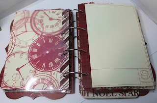
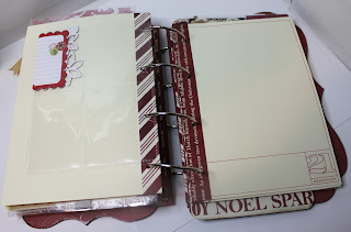
Day 1: I decided to embrace a few things this year. The first being the transparency overlays like last year, only this year I went for irregular shapes and sizes. Which ties into the second thing I embraced, irregularity. Oddly shaped pages. Pages and embellishments that stick up, or down, or both. And a variety of photo pocket sizes. The third thing I did is minimal embellishments. Beyond the day's number, I added very few extras. I know from past experience that the stories I decide to tell in December will need their own embellishments so I'll add them as I go along. Ditto the patterned paper strips in the lower rectangle next to the numbers on the card stock pages.
Day 4 shows the second example of a photo pocket. These are from Pink Paisley's combo pack (I bought them for Ali's One Little Word). For Day 2 I used a cut down CD pocket holder from Avery. So you see, odd sizes for different sizes of pictures/ephemera!
Day 7 uses another Pink Paisley pocket. This is one of the ones that folds over and attaches. You can see the string attacher above the 7. I'll probably replace it with something prettier eventually.
A note also about the back side of the brown paper - I'm not crazy about the colours in this pattern (they don't match my red, cream and brown scheme) but I will most likely cover it with a picture or collage of pictures later so I'm not sweating it now.
Day 19: Kind of really love how this turned out. I made a couple boo boos (taped it to the wrong side so had ripped paper to hide) but I love how the tags and the ribbon came together to complete this page.
Okay, I know I said I wasn't going to comment much but this overlay needs some explanation. The paper was originally white and sparkly but the white was too stark with my cream scheme so I got out my trusty mists and sprayed the heck out of it. I used a couple of colours (a brown and a red) and the combination gives this nice antiquey red that perfectly matches my scheme.
Oh, and I gave the back a quick spritz too as it may be seen.
Day 24 has more spritz on the originally white snowflake paper. But I didn't spray the back as I'm sure I will be covering it ... maybe. I did staple it shut though ... hmmmm ... oh well.
And then we come to Day 25. I really love this page. At least, I did until I punched the holes in the wrong spots! Sigh. Oh well ... embracing imperfection right along with irregularity!!
And while we're on the topic of punching holes in the wrong spots ... I did it to ALL the card stock pages originally. but I cleverly covered them up with strips of coordinating paper and repunched in the correct spots. Yup, pattin' myself on the back a little bit there!
There, all done!
Here it is all ready for pictures and extras. Looks pretty thick already, doesn't it?
Thanks for stopping by. Are you doing a December Daily? Leave me a comment so I can share in your fun too!


Holy crap, girl, I'm blown away!!! This is incredible, and I'm not just saying that 'cause I love ya, it really is gorgeous!!! I love the red/cream/brown, soooooo sophisticated! I love the transparencies, and that misting is awesome! I've been working on my DD for the past week or so, and it's going soooooo slow, not happy about it at all, but I'm liking it so far. I wanted to branch out and use some transparencies, etc. but couldn't find any at my LSS and now it's too late - I just have to go with what I have, which is more than enough really. OK, you've inspired me to get on it, so I'm off and running, probably leave you a message on your P12 post tomorrow. Hugs, Roxy.
ReplyDeleteI came across your blog via Ali E's linky group. Just wanted to say that your album is so pretty! I also had to learn to embrace imperfection and irregularities when I made mine.
ReplyDeleteGreat job...I love it. Especially the cover.
ReplyDeleteI really like your DD :) The strips had caught my eye, and I was planning on asking about them - was thinking that they were for reinforcement AND embellishment -- I really like them.... and now that I now why they're there, I'm thinking it's genius!
ReplyDeleteVery cool - so this is what you've been up to. I have some photos to send you of a similar project I saw at Convention this year, so that you can plan for next year!
ReplyDelete