Starting with the page for Creative Accents ...
This will be the title page of the album. The yellow chevron circle is actually fabric - Stampin`Up Essentials Designer Fabric to be precise - which I cut with my pinking sheers. I loved the bright happy yellow and felt it was the perfect way to start the album. This page was created brand new for this challenge (i.e not one of the base pages I'd created) but it will fit in perfectly as I have kept all the patterns and colours consistent by using leftover scraps from my other pages. Also, none of the other pages have embellishments on them yet so I can create continuity that way too.
The title. The Disney Vacation plus the balloons/fireworks was a title sticker while the May 2012 were added using glittery foam letter stickers.
I figured the title page probably doesn't need a ton of journaling so this little tag did the trick.
There are a few things I mean to add to pretty much every page I do and you can see some of them here. The fabric flower, the dots (I think they are called Candy Dots) and the Mickey head shaped bling. I've got a few different washi tapes that will get added here and there as well as little word phrases (cut out from a 12x12 piece of patterned paper.)
This next layout is for Sketch Inspiration using this sketch.
I wanted to use these portrait oriented photos so I made some changes to the sketch to accommodate them. It's not too far off though.
This is one of my pre-made base pages but the paper strips in the background worked for the sketch.
More fabric flowers on this one as well as a word sticker.
Instead of the horizontal element shown at the top of the page in the sketch, I chose to anchor my photos with a horizontal element at the bottom of the page. You can also see the Mickey gem too!
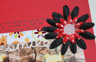
My title may be a little hard to read so I'll write it out here again - Up Close And POOHsonal. Ha, ha, ha!! A little play on words there!! The journaling explains it. It reads: "Christine was fast asleep and Marley was saving room in her autograph book for Princesses so Paige got some one-on-one time with Winnie-the-Pooh!"
I have quite a few pictures of this particular event and had created a companion page during my base layout stage. This is not a double page spread but they will face each other so there is more "communication" between the two single page layouts than you'd normally see. Here is it - While You Were Sleeping - and tells the other half of the story.
I used a sticker journaling spot for the title and wrote my journaling directly onto the back ground paper. To further anchor the photos I added the other half of the strip of black card stock from the layout above as well as some washi tape and white border punched card stock. The word sticker seemed appropriate!
Here's a better look at the anchoring line.
I added the Mickey gem to the flower accent in the top right corner. I also repeated the washi tape and punched white card stock up here.
I still have more pictures of Paige with Pooh Bear and more story to tell (like how awesome it is that she will now hug mascots when she used to run away in terror!) so I will likely add a divided page protector between these two layouts with those photos. I didn't get to that today though.
Well, that's all I have for you today. Thanks for stopping by!


You are off to a great start with your album! I love, love, LOVE the title page, especially the fabric circle!!! And I love how you've got a plan in place to keep the album consistent - those Mickey gems are awesome! Thanks for joining us at Seriously Creative Challenges, hugs, from moi!
ReplyDeleteWow lovely.. thanks for joining us at Creative Accents Challenges.. take care
ReplyDeleteThese are such great layouts! I looove that circle in the background on the first one! Love all the great Disney photos too! So glad you could join us @ SCC!!
ReplyDelete